Premier League 2017 - 2018
 As if Premier League teams were not already hoovering up vast quantities of cash, clubs are now permitted to sell advertising space on one sleeve of their shirts. It has been estimated that this could generate an extra 20% on the current value of shirt sponsorship.
Eleven out of the twenty Premier League teams now have their shirts sponsored by online casinos. Only those involved in the gambling industry can regard this as a healthy development.
You are welcome to Contact Me with corrections and additions.
Contributors are credited in brackets. Opinions expressed on this page are those of HFK and not contributors.
Premier League | Championship | League One | League Two

First

Special
29 Dec v WBA

Second

Third
Designer: Puma
Sponsor: Fly Emirates
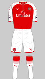
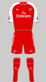
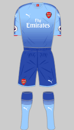
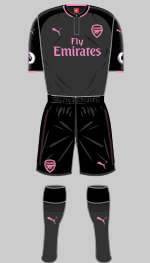
By winning the FA Cup, Arsene Wenger secured a new contract after poor performances in the league had put his position in doubt. If you fancy shelling out a cool £100 you can be the proud owner of an "authentic" first shirt, making a mere £55 for the replica seem a bargain. The red used here is "a deeper more historic red." I would love to see some evidence to support this statement. Black has been the colour of choice for third strips over the last two seasons and the new one follows this trend but in charcoal and black with pink trimmings. The fading two-tone effect on the change strip is rather good.
The club arouse considerable comment with the decision to wear red shorts and socks with their "home" shirt for the visit to West Brom. It has been a matter of principle for almost 40 years that the first choice strip should not be altered and the last time their iconic shirt was teamed with red shorts was almost 40 years ago..
(Diamond One, Paul Clare)

First

Second

Third
Designer: Umbro
Sponsor: Mansion 88
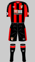
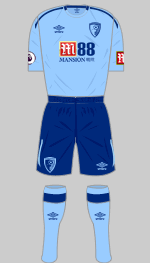
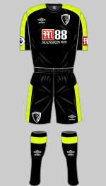
Umbro continue to make strides towards recovering their market share at the top level and have replaced JD Sports here. The offering to Bournemouth is typical of their sure-footed approach to design which incorporates classic lines with subtle features. In common with all their new strips, the iconic double-diamond trim appears in tonal rather than contrasting fabric. The change strip shows off another new Umbro trim, a stretched version of the "running diamond."
(Szin Fletcher, Leo Howard, Martinos Perdikis)

First

Second

Third
Designer: Nike
Sponsor: American Express + JD Sports
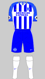
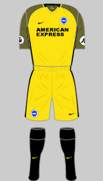
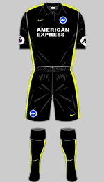
Brighton are in the top tier for the first time in 34 years. The first shirt combines stripes with Nike's Vapor design but at least the socks are white rather than in a third colour. The alternative is in "University Gold" and black: the apparent colour of the sleeves is deceptive. Vapor shirts incorporate very fine lines in a contrasting colour (black here) against the main colour (gold). In this instance these bleed into each other to create an olive green effect. Last season's black strip is retained as third choice.
(Phil Swain, Leo Howard)

First

Second

Third
Designer: Puma
Sponsor: Dafabet
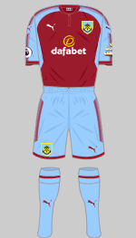
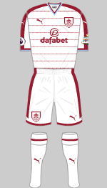
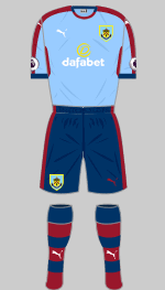
The new first strip would have looked so much better teamed with white shorts and socks. The white alternative looks pretty smart but in the spirit of complex detailing, which is a feature of the new season, the horizontal lines on the shirt are made up of the word "CLARETS" repeated.
(Benjamin Raynor, Lukman Rewa, Charlie)

First

Second

Third
Designer: Nike
Sponsor: Yokohama Tyres + Alliance Tyres
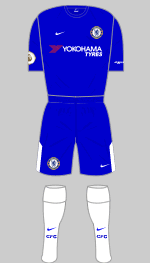
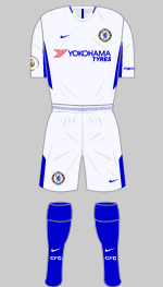
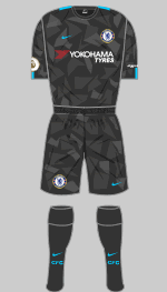
Chelsea clinched their sixth title having won 30 of their 38 games, a record for the top tier. After cancelling their contract with Adidas it is no surprise that Nike have used their financial clout to secure a fifteen year contract worth £60 million a year. Their first offering is an elegant recreation of the classic Chelsea strip of the 1970s although they seem to have run out of material for the stripe on the shorts. According to Nike's marketing department, the colour was matched to an original 1960s shirt. The change strip is a very pale grey/blue described as "pure platinum." The third strip in shades of dark grey is Nike's "Camo" design, shared with Manchester City and Spurs, and is intended to be worn as an alternative in European matches.
(David Niblock, Gabriel R, Jack Henderson, Nik Yeomans)

First

Second

Third
Designer: Macron
Sponsor: ManBetX + Dongquidi
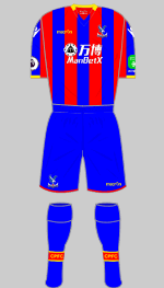
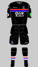
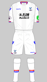
Launched with the strap line "South London is Ours", the new first shirts have the names of the five South London boroughs printed vertically into the stripes on the back. Otherwise, this is a straightforward take on a classic Palace strip. The black alternative is enlivened by a horizontal band in the club colours.
(Lynn Hollingsworth, @RockSkini, Diamond One)

First

Second

Third

Special
Designer: Umbro
Sponsor: Sport Pesa
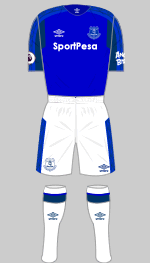
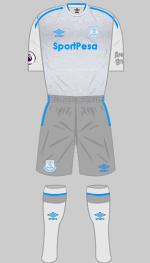
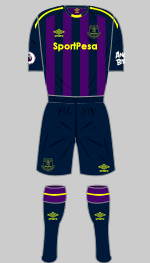
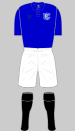
Umbro have revived their classic diamond trim for the new season and on the Toffee's shirt it is in navy, a rather subtle effect. I like the self coloured crew neck, a reminder of the classic Everton look. Contrasting collars were only introduced in 1956. The change strip is in two shades of grey with bright blue trim and it has a novel abstract graphic printed into the fabric inspired by the Everton Lock Up tower that features on the club crest. Not to be undone by their local rivals, Everton have introduced a commemorative kit to celebrate 125 years at Goodison Park, based on the strip worn during the Dixie Dean era.
(Szin Fletcher, William Geddes, Bertie Welsh, Conor Lenehan)

First

Second

Third
Designer: Puma
Sponsor: OPE Sports + Pure Business Group
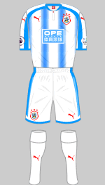
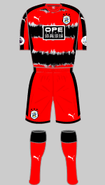
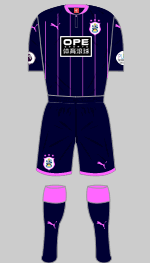
A dramatic victory over Reading on penalties in the play-off final has brought the Terriers back to the top flight for the first time since 1972. Their now traditional lightish blue stripes are this season disfigured by Puma's latest fading spots gimmick. Our correspondent admits these are growing on him after the initial shock. Very like the creeping fungus they resemble then. The alternatives (they have not designated change and third) is a recreation of an iconic bad-taste kit from 1991-92 and a dark navy number with shocking pink trim. All three will certainly liven up the Premier League.
(Roger Pashby, Leo Howard)

First

Second

Third
Designer: Puma
Sponsor: King Power + Siam Commercial Bank
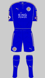
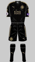
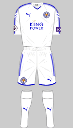
In February, when the team were hovering just above the relegation zone, the architect of their Premier League title, Claudio Ranieri was sacked. In the end the Foxes reached the Champions League quarter-finals and finished comfortably in mid-table. We're staying with all-blue and gold trimmings, now in Puma's latest template. Some fans are agitating for a return of traditional white as a secondary colour.
(Diamond One)

First

Charity
14 Oct v Man Utd

Second

Third

Limited Edition
Designer: New Balance
Sponsor: Standard Chartered + Western Union
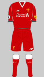
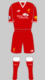
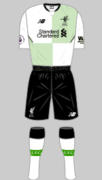
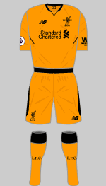
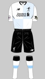
White trim returns and the colour is slightly darker than usual ("Shankly Red" no less): a tidy design that is likely to be popular. The change shirt harks back to the bottle green and white change strips of the 90s, but with fine pinstripes instead of blocks of colour. A limited edition boxed version in the team's original colours has been produced with just 1892 copies available. It is unlikely this will be worn by the team. Orange is a curious choice for the third strip but it might be acceptable when the team play at Stoke.
(Nik Yeoman, Gabriel R, Cameron Fletcher, William Thomas)

First

Second

Third
Designer: Nike
Sponsor: Etihad Airways + Nexen Tire
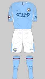
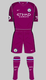
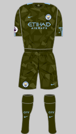
The latest version of the Vapor template is at least an improvement on the unpopular design introduced a year ago. White shorts are restored and the socks have a maroon ring on the turnover, a reference to the strips worn in the Sixties. The maroon theme is picked up in the change strip but I don't see why the sky blue trim at the collar could not have been extended to the applications and short trimmings. The black panels on the side of the shirts is Nike's latest wearable air conditioning system. The Camo third strip is intended for Europe and is a design adopted by City, Chelsea and Spurs.
(Nik Yeomans, Matthew Hague-Lang, Keiran Main)

First

European

Second

Third
Designer: Adidas
Sponsor: Chevrolet
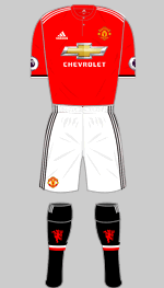
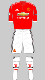
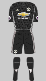
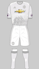
United were the first Premier League team to introduce an all-black change strip in 1993, a motif that has appeared regularly and here we go again. The pattern printed into the fabric is the same as the one that appeared in blue and white in 1990-92. For once, Adidas have resisted the temptation to add gimmicks to the first choice strip and the result is pretty satisfactory. Red trim might be better on the shorts and I would prefer to see the sock trim on the turnover rather than the calf but I'm just being picky.
Reaction to leaked images of the prototype third shirt was unfavourable but the production version is much more muted and in my opinion one of the seasons' outstanding designs. Using the Creator Studio platform fans submitted their own designs for United, AC Milan, Juventus, Real Madrid and Bayern Munich. These were short listed and the winners for each club chosen by an expert panel. Aniello Carotenuto's concept was chosen and shows the statue of Best, Law and Charlton that stands outside Old Trafford.
(Ahmad Omar, Tony George, Jeff Ng)

First

Second

Third
Designer: Puma
Sponsor: Fun88 + MRF Tyres
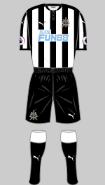
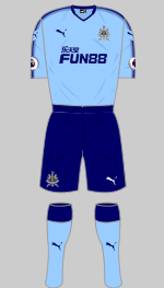
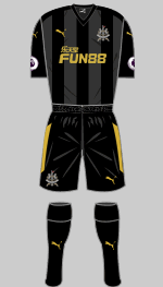
Toon have bounced back after a season in the second tier and to mark their 125th anniversary, Puma have provided a classic design devoid of the spurious detailing seen in recent seasons. A Chinese online gambling casino replaces the purveyor of payday loans at exorbitant interest rates: hardly an improvement.
The light blue change shirts are a nod to East End FC, one of United's precursors, who wore these colours briefly in the 19th century.
(Jonathan Auty)

First

Special
v Newcastle 10 March

Second

Third
Designer: Under Armour
Sponsor: Virgin Media
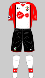
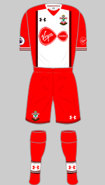
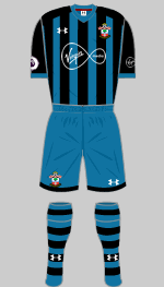
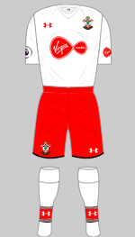
Under Armour have looked to the very popular early Eighties shirts of the Lawrie McMenemy, Kevin Keegan and Alan Ball era. There is fine black and red edging to the white shirt panel (which carries over on to the back) and shorts, which is perhaps a bit too fussy but otherwise this is a very good effort. The teal and black alternative is totally original.
Last season's third shirt was pressed into service for the visit to Bournemouth.
None of the alternatives were considered suitable for the trip to Newcastle so special edition shirts were ordered that were solid red on the back. This was worn with red shorts and socks.
(George Pannell, Martinos Perdikis, Airbus A380-800, Simon Ståål)

First

Second

Third
Designer: Macron
Sponsor: Bet365 + Top Eleven
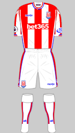
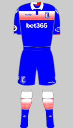
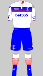
Stoke were the first Premier League team to take advantage of the new rules on sleeve advertising. The broad stripes on the first shirt look good but I definitely don't like the blue trim. Stoke rarely wear an accent colour but when they do, it's generally black. That said, blue has featured in their crest since 2001 so it's not unreasonable to use it on the main strip.
(Diamond One)

First

Second

Third
Designer: Joma
Sponsor: Letou + Barracuda
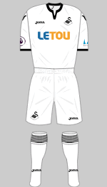
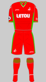
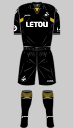
Joma have to work hard to come up with variants on Swansea's white first kit each season. This term we have contrasting trim at collar and cuff with fine black rings on the sock turnover and very elegant it looks. The Welsh national colours are used for the change strip, last seen in the centenary season 2012-13. This is not a bad idea but is rather spoilt by the over-complicated collar and cuff trim and the jacquard pattern printed into the front of the shirt. Since the white and red kits are not suitable to wear at Southampton or Stoke, a black third strip has been introduced.
(William Geddes, Leo Howard)

First

European

Second

Third
Designer: Nike
Sponsor: AIA
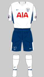
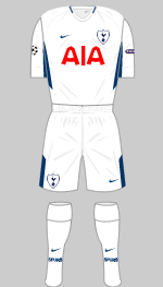
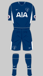
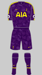
Nike have replaced Under Armour whose contract expired over the summer. Although their strips are standard Vapor II templates, they are smart enough. The cockspur once again appears against a shield, a welcome touch. As Premier League runners-up, Spurs are in the Champions League so an all-white European kit will certainly be needed. Spurs have the new Nike Camo design in the hamper. The team are playing at Wembley this season while their new stadium is built.
(Diamond One, Tony Sealey)

First

Second
Designer: Adidas
Sponsor: FxPro + 138.com
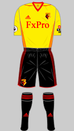
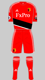
The Canadian company Dryworld lost their contracts with Watford and QPR (as well as with several Brazilian clubs) because they failed to meet their financial obligations and deliveries were late, a shame given the quality of their designs. Watford now go with standard Adidas designs which are smart if uninspiring.
(Eric O'B, Diamond One)

First

Special
v Southampton Feb 3

Second

Third
Designer: Adidas
Sponsor: Palm Eco-Town + 12Bet
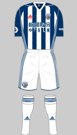
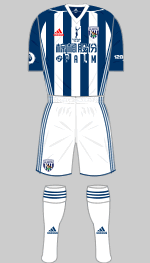
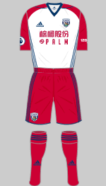
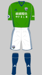
I generally think that West Brom's first strip should be predominantly white, a hold over from the iconic strips of the 1960s. Navy sleeves can be forgiven once in a while but the back of these tops is all-navy, which just doesn't feel right. Cherry red once again features in the change strip. With white featuring so prominently in the first and change shirts a third shirt was always going to be needed. There are no replicas of the green shirt available but match worn ones are auctioned off in aid of charity. Following the death of Cyrille Regis in January, the team wore commemorative shirts bearing a silhouette of Regis celebrating a goal. Proceeds from an auction of match worn shirts and a portion of the profit from replicas sold was donated to a charity of the Regis family's choice.
(Alec Hitchman, John Hewitt, Diamond One, Leo Howard, Ahmad Omar, Sean Paul)

First

Second

Third
Designer: Umbro
Sponsor: Betway + MRF Tyres
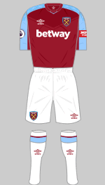
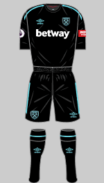
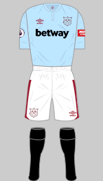
The Hammers' latest change strip is black with "Bluefish" trim already. The tapes on the shoulders and shorts have Umbro double diamonds sublimated into the fabric. The first choice shirt has a sublimated yoke printed into the front that is intended to evoke the famous Admiral shirt worn in the 1976 European Cup Winners' Cup final. Once again the club has reached back into their early history for a third strip, this time modelled on the very first outfit worn when Thames Ironworks became West Ham United in 1900. Of course the original wasn't defaced by an online bookie's logo.
(Alec Hitchman, Szin Fletcher, Julia Shanahan, Diamond One, Johannes Keil)
 As if Premier League teams were not already hoovering up vast quantities of cash, clubs are now permitted to sell advertising space on one sleeve of their shirts. It has been estimated that this could generate an extra 20% on the current value of shirt sponsorship.