Sky Bet Championship 2015 - 2016
 Championship members have agreed
You are welcome to Contact Me with corrections and additions.
Contributors are credited in brackets. Opinions expressed on this page are those of HFK and not contributors.
 Championship members have agreed
You are welcome to Contact Me with corrections and additions.
Contributors are credited in brackets. Opinions expressed on this page are those of HFK and not contributors.
First
Second
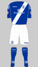
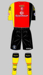
This is Birmingham's 140th anniversary and their technical sponsor has pulled out all the stops to produce two memorable kits for the occasion. Based on the original Small Heath Alliance colours worn in 1875, the first strip features a commemorative crest that revives the very popular monogram worn in the 1970s. The names of 1,875 (geddit?) supporters who subscribed £195 have their names embossed into the sash and receive their shirts in a commemorative box with personalised scarf and certificate. The new change strip is a revival of the celebrated German Flag kit worn in the 1970s. Bostin'.
(Richard Evans, Diamond One)
Second
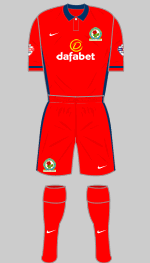
Blue is restored to the left hand side of Rovers' shirts this season, which is where it has been since 1946 with the exception of the last two seasons. Red trim, which first appeared in 1976, also returns.
(Ricky Berry, Roger Whiteside)
First
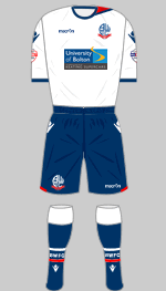
First (2)
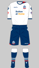
Special
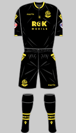
Second
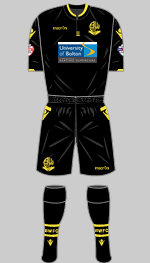
Second (2)
Special
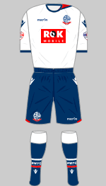
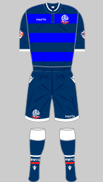
The new Wanderers' first kit is understated and features a novel inset to the left of the crew neck where a Lancashire rose is embossed into the fabric - a nice touch. The black change strip is attractively trimmed in pale gold. The shirts have a new sponsor but the limited edition third kit, which commemorates the 33 who died in the Burnden Park disaster in March 1946, is unsponsored. £10 from each sale is donated to the Bolton Young Persons Housing Scheme.
The shirt sponsorship for Wanderer's annual community fixture was again donated to Bolton at Home.
(Bryn Lunt, Alec Hitchman, Alexander Leiberich, David Rafelle)
First
Second
Special
Third
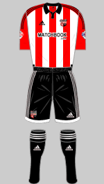
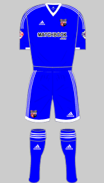
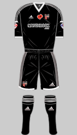
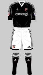
Rather disarmingly Brentford's Chief Executive, Mark Devlin, has described the Bees' latest first strip as "bespoke and...designed by Adidas solely for Brentford." This is a slightly generous interpretation: Adidas allow clubs to choose the collar design and specify the colours for the sleeves and three-stripe trim on their standard templates. Devlin also helpfully adds that the "Away kit needs to be significantly different from the home kit to ensure there are no colour clashes." So pleased he cleared that up. The black kit was worn at Blackburn on 7 November and signed match shirts auctioned off in support of the British Leagion's Poppy Appeal. It appeared later in the season without the poppy and with white shorts.
(Nick Bruzon, Brendan Nevin, David King)
First
Special
Second
Third
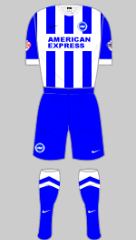
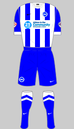
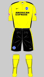
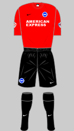
Brighton are keeping their "home" strip and have introduced two new change kits. The special kit celebrates 25 years of the club's community arm, Albion in the Community, which runs 25 sports clubs for disabled people across Sussex.
(Matthew Powell, Patrtick Rawlins, Bertie Wright, Kris Culmer)
First
Second
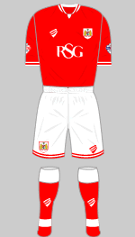
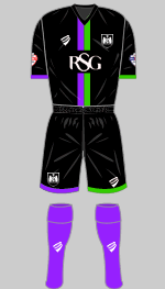
City were League One champions last season. Once again their in-house designers have sought inspiration from the club's back catalogue and the piping at collar and cuff references classic shirts from the 1970s. A petition to revive the old robin crest for its fortieth anniversary next season now has 1,000 signatures. The garish purple and green colours that featured on last season's third strip look striking on the black change kit.
(Travis Hogarth-Colby, Thomas Gingell)
First
Special
Second
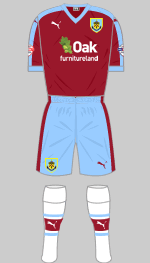
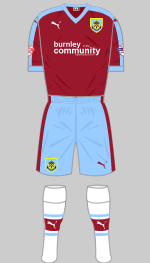
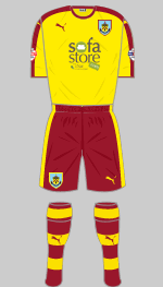
The Premier League proved too much for Burnley who must console themselves with generous parachute payments. Although blue sleeves are favoured at Turf Moor, plain claret shirts trimmed in sky blue have appeared several times in the club's history. They would have looked much better, however, worn with white shorts. The change kit, chosen by the fans, looks very smart in yellow and claret.
(Travis Hogarth-Colby, Simon Gibson)
First
Second
Third
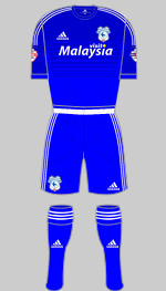
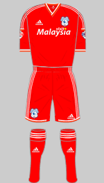
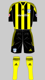
It may be a standard Adidas design but supporters are just delighted to see their team once more in blue following Vincent Tan's change of heart last December. The club crest has been redesigned to give more prominence to the traditional bluebird. The Welsh dragon that has featured on many recent crests is replaced by its Chinese cousin. Oddly the change strip is in a different template, Condivo from 2014. Replicas of the third kit are not on sale but fans can get hold of one by sponsoring a player.
(Sean Paul, Alexander Leiberich)
Second
Third
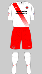
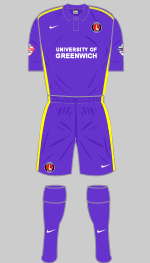
There are no surprises with Charlton's new first choice kit, which is a return to their classic, uncluttered look, with a neat polo collar. The fading sash on the change strip is attractive and the other elements of the strip can be combined with the first kit if necessary. Third choice is purple with bright yellow volt trimmings.
(Alexander Leiberich, Al Gordon, David King)
Second
Third
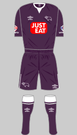
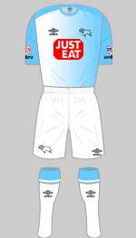
There is a diamond pattern embossed into Derby's latest white shirt, a motif that was seen in the late 1980s. Otherwise the kit is straightforward and pretty smart. The change strip is an interesting shade of dark purple. The third shirt fades left to right from "Scuba Blue" to white with a fine horizontal stripe printed into the fabric.
(Alexander Leiberich)
First
Second
Third
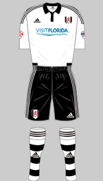
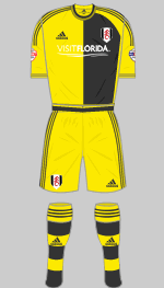
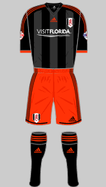
Images of Fulham's new strips were accidentally released but the official launch was postponed because the sponsorship had not been confirmed. The change strip has not been well received, yellow and grey being an unfamiliar combination for the team. Their change strip is retained as third choice.
(Richard Rundle, Martin Gooday, Sean Paul)
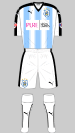
First
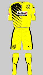
Second
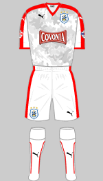
Third
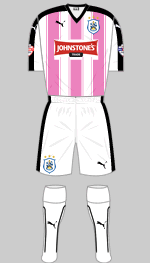
Special
The Terriers will be able to safely guide school children across busy main roads wearing their hi-viz change strip. Light blue is in vogue at John Smith's Stadium: photographs of the team in the Herbert Chapman era seem to show the team in pale blue stripes but this is amost certainly an illusion created by the photographic emulsions of the period. Nevertheless, they do look good. The third kit has a grey camouflage pattern on the shirt and is dedicated to all who have fallen in war including the eight Huddersfield players who lost their lives in 1914-18. It was worn for the first time at Wolves on 3 October. The charity strip was created to raise funds for the Town Foundation and incorporated the name of 500 supporters who had pledged money to the charity.
(Roger Pashby, Neil Kelly)
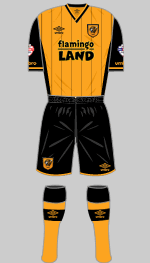
First
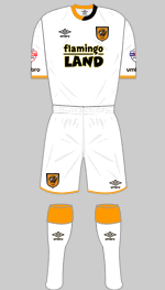
Second
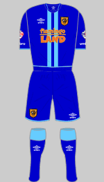
Third
Relegated Hull have reverted to plain shirts with pinstripes that resemble those worn in 2009-10 which coincidentally were also made by Umbro. The alternative is a smart white strip with amber and black trim. The smart third strip, with "scuba blue" detailing, was launched in October.
(Patrick Rawlins, Bazza Houston, Diamond One)
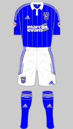
First
Second
Third
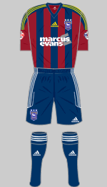
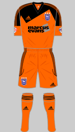
Adidas trim on the shoulders and sleeves, pinstripes and a flappy collar - this is the sort of strip they dream about in Suffolk. Inspired by the team's golden period under Bobby Robson, the new blue shirts are going to fly off the shelves. The third kit is orange but not, as previously reported, identical to last season's change strip: it is in fact the Toque design from 2013.
(Travis Hogarth-Colby, Patrick Rawlins, David Rafelle)
Massimo Cellino has now been allowed to assume control of the club despite previous convictions in Italy where he still faces charges of fraud and attempted embezzlement. His control of Leeds looks likely to be as entertaining for neutrals as that of Ken Bates. The club is now involved in separate legal disputes with its kit supplier, Macron, and shirt sponsor, Enterprise Insurance, both of whom have contracts due to end in 2016. As a result Kappa (who supplied Cellino's former club Cagliari) supply the new strips which are without sponsorship.
(Brendan Staunton, Martin Hart)
Second
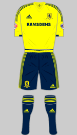
If you like Adidas' designs the new first kit will please you. It's conservative, understated and a bit dull but it does have a new feature in the finely checkered trim at the neck, sleeves and waist. Yellow and dark navy are used for the change strip.
(Mark Jones, Ryan Dalton, Travis Hogarth-Colby, Warren Laroche)
First
Second
Third
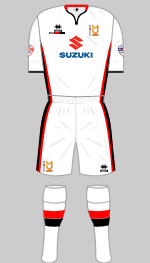
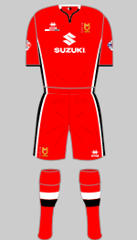
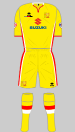
Promoted as runners-up last season, the Dons have opted to keep a yellow third kit. As usual their strips are matching templates, which always looks smart, and this season are supplied by Italian company Errea.
(James Blackwell)
First
Second
Third
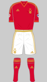
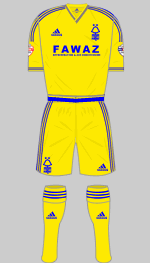
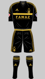
This season marks Forest's 150th anniversary so a commemorative strip is introduced, in a deeper shade of red than usual with metallic gold trim and without sponsorship. Otherwise, this "special strip" is just a standard template as is the yellow alternative trimmed in blue, a reminder of Forest's change kit in their European heydey. The shirts once again promote the company of Forest's chairman, Fawaz al-Hasawi, in the absence of an external sponsor. Replicas of the new third strip went on sale on 4 January.
(Alexander Leiberich, Patrick Rawlins, anon)
Second
Third
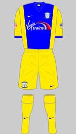
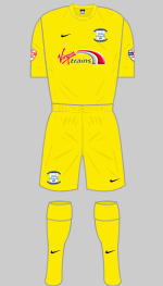
Promoted via the play-offs, North End are essentially wearing the same first kit as last season except that the shirt is Nike's Energy III design, which has an almost imperceptible checkered pattern and a V neck rather than a polo collar. An older Nike design is used for the change strip. This was not suitable when the Lilywhites visited QPR so last season's all-yellow strip was used instead. This also appeared at Burnley for no obvious reason.
(George McDermott, Patrick Rawlins, Roger Whiteside)
First
Special
Second
Third
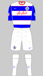
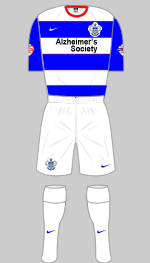
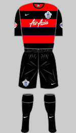
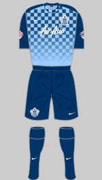
It's good to see Rangers back in broad hoops and, in keeping with the trend for retro inspired outfits, the hoops are edged in red, an idea first seen in 1983. The change strip is also a revival of a popular design but it's a shame to see the awful checker board Precision III design used for the third choice.
(Travis Hogarth-Colby, Simon Ståål)
First
Second
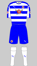
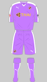
The Biscuitmen are wearing proper hoops again of a similar width to those seen in the late 1970s (when they were also matched with white sleeves). This is really quite smart, although, being old school here at HFK Towers, I would prefer to see them in white shorts. The change strip, in African Violet has divided opinion but has the merit of being distinctive.
(Alexander Leiberich, Les Chandler)
First
Second
Third
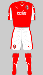
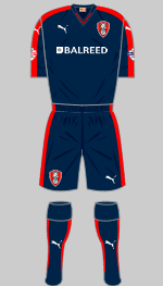
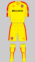
The Millers are wearing the new Puma Pitch design. It is interesting to contrast their first choice shirt with that of Fleetwood Town, which is the same template but with white rather than red trim and all the better for it in my view. The alternatives offer plenty of contrast.
(Chris Poplar, Michael Hollis, Miller Fan)
Second
Third
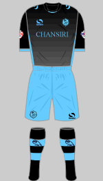
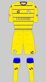
Sondico's latest first kit is a classic interpretation of Wednesday's traditional striped shirts, which usually look best worn with black shorts. Trimmings are kept to a minimum. The name on the shirts is that of the club's owner. The alternative is very distinctive in black and aqua while the torso shades from black to grey. Last season's yellow change strip was needed at Newcastle in the Capital One Cup.
(Mark Badger, Alexander Leiberich, Chaz Gardner)
Second
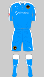
The simplicity of the Wolves first kit shows off the latest Pitch template to good effect. The broad stripe on the shoulders, sleeves and shorts revives the motif on the earliest Puma football kits from the 1970s but which failed to achieve the iconic status of Adidas' three stripes. The alternative is nothing to write home about: light blue is not really associated with the Wolves but has been worn previously, in 1990-91, 1992-94 and most recently in 2000-01.
(Ryan Dalton, Travis Hogarth-Colby)